We created a beautiful header and the hero section in the previous article. Now, it’s time to style the sections within the body of our page.
We will add styling to the page section-by-section, starting from the menu section. But before that, we will define a generic class “section” that will be used for all the other sections. That being said, let’s get started.
Styling the Section
The section class is a reusable class that we have used for all the sections in the body of the page. We will define a definite width, height, and margins for this section and use inline CSS wherever we need changes in the section.
After the hero_text class, add the following code:
.section{
	width: 100%;
	height: 100vh;
	background-color: rgba(0,0,0,0.8);
	margin-top: 0;
	float: left;
	border-bottom: 1px solid white;
}
You’ll notice that all the divs with section classes have changed according to the properties defined.
Styling the Menu Section
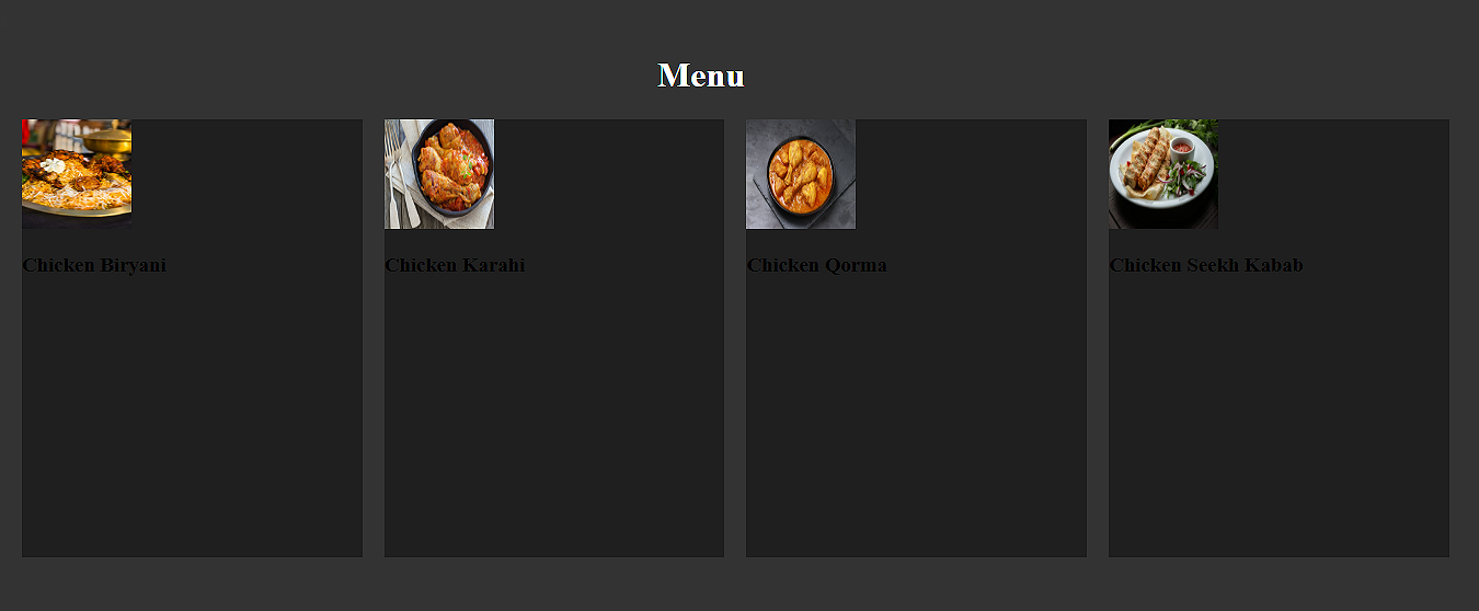
In this section, we will style the elements in our menu section. We have 4 menu items, meaning we will divide our menu section into 4 equal divs with menu_item class.
.menu_item{
	width: 23%;
	height:400px;
	background-color: rgba(0,0,0,0.4);
	float: left;
	margin-left: 20px;
	border-radius: 5px;
}
This is how our section looks so far:
Now, we have to set the position and sizes of the image and name of the item. To do so, we will first define the width and heights for both divs:
.item_img{
	width: 270px;
	height: 300px;
	margin-top: 30px;
	margin-left: 20px;

}

.item_text{
	width: 270px;
	height: 40px;
	text-align: center;
	margin-left: 20px;
	color: white;
	font-size: 20px;
}
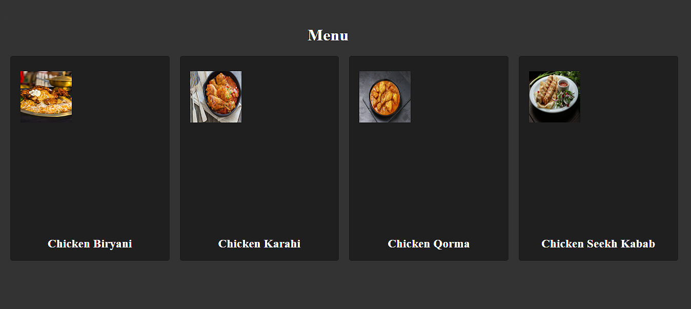
Our webpage still looks as follows:
Let’s add a new class “menu_img” to the img tags for each item:
<div class="item_img">
	<img class="menu_img" src="images/Kababs.jpg" width="100" height="100" alt="Chicken Seekh Kababs"/>
</div>
Define the class as follows:
.menu_img{
	width: 100%;
	height:100%;
	border: 1px solid black;
	border-radius: 10px;
}
By doing so, we made our section look more attractive and beautiful.

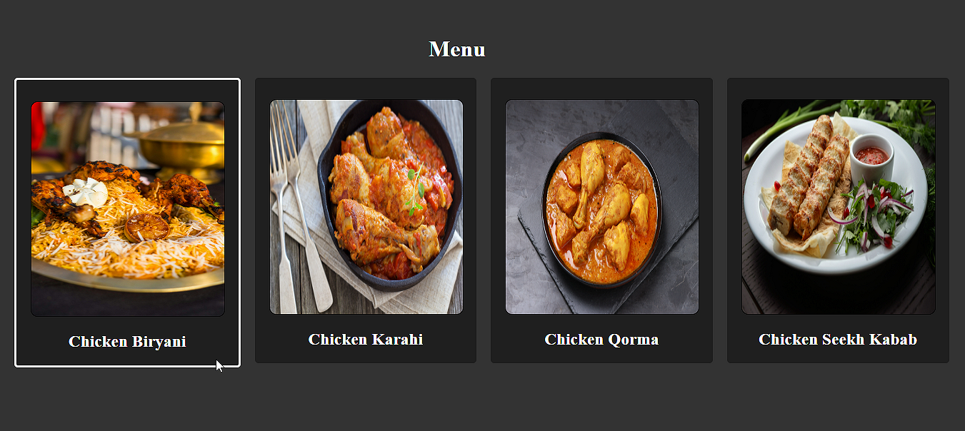
Let’s also add a hover effect to make it more engaging:
.menu_item:hover{
	border: 3px solid white;
}
The section looks complete now. You can add hover effects on other divs in a similar way.
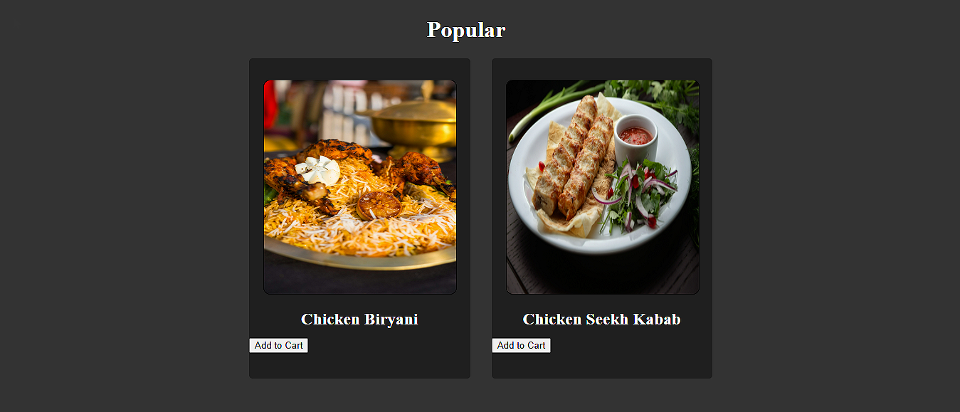
Styling the Popular Section
The next section is Popular, where we display our best dishes with an add-to-cart button. We actually do not need to redefine any classes for this division since we can reuse existing classes. Only some changes in the HTML have to be made, such as:
i. Redefining the height and left margin of the menu_item divs with inline CSS:
Popular Menu Item 1:
<div class="menu_item" style="height:450px; margin-left: 350px;">
Popular Menu Item 2:
<div class="menu_item" style="height:450px; margin-left: 30px;">
ii. Assigning menu_img class to the img tag for each item:
<img class="menu_img" src="images/Kababs.jpg" width="100" height="100" alt="Chicken Biryani"/>
I have added only 2 items in this section. You can add more if you want. Remember to adjust the properties accordingly.
.add_to_cart{
	width: 270px;
	height: 40px;
	margin-left: 20px;
}
Then, applied the nav_btn class to the Add to Cart buttons and used some inline CSS to format it as per requirement:
<button class="nav_btn" style="width: 150px; height:30px; margin-left: 60px;"> Add to Cart </button>
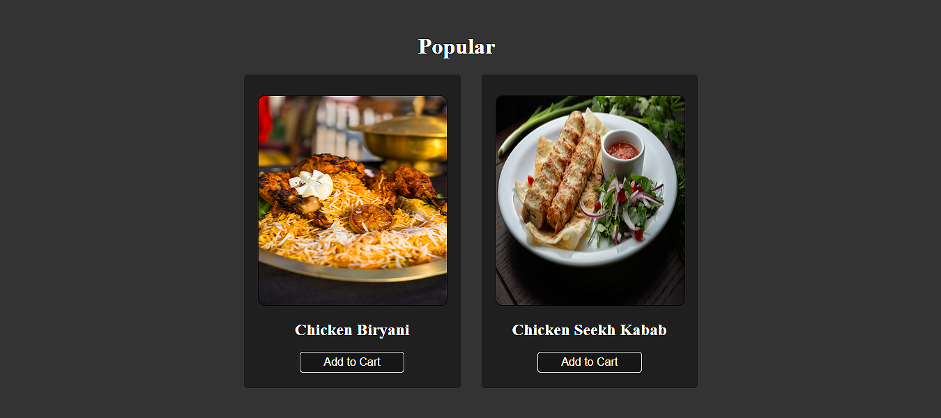
Here’s how our Popular section looks now:
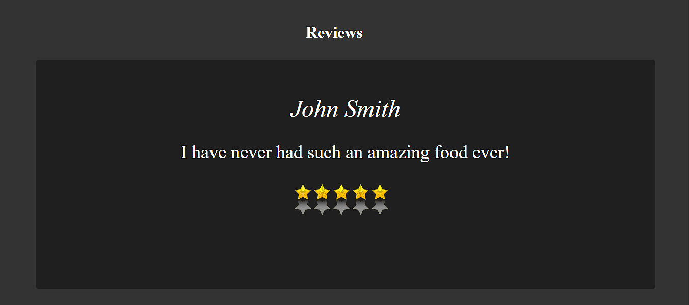
Styling the Reviews Section
In this section, we will show a review from the customer. Set the position of the section first:
.review{
	width: 90%;
	height: 450px;
	margin-left: 70px;
	background-color: rgba(0,0,0,0.4);
}
Now, style the customer name div as follows:
.name{
	color: white;
	width: 100%;
	height: 80px;
	text-align: center;
	font-size: 48px;
	font-style: italic;
	margin-top: 20px;
	margin-bottom: 60px;
	float: left;
}
Format the review text:
.review_text{
	width: 100%;
	height: 200px;
	text-align: center;
	font-size: 36px;
	color: white;
}
Set up the div for review stars:
.name{
	color: white;
	width: 100%;
	height: 80px;
	text-align: center;
	font-size: 48px;
	font-style: italic;
	margin-top: 20px;
	margin-bottom: 60px;
	float: left;
}
Set up the div for review stars:
.review_stars{
	width: 100%;
	height: 100px;
	margin-top: -200px;
}
Good to Know: You can assign a negative value in margins if you want the object to move in the opposite direction. For example, in the above code, margin-top: 200px moves the div upwards.
Finally, set the stars image:
.stars{
	width: 1200px;
	height: 200px;
}
Our review section is ready:
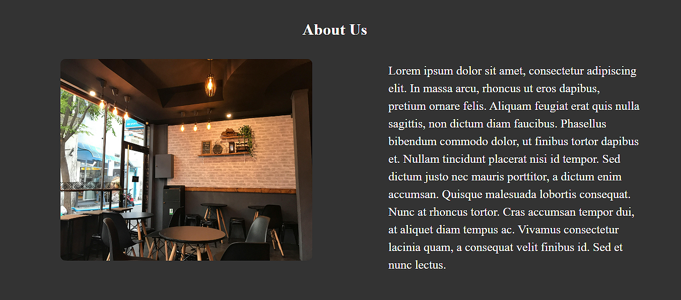
Styling About Us Section
The About Us section tells the visitors about your business or company. Let’s start styling it. In this section, we only have an image and text. So, we will first set the positions for both.
We’ll move the text to the right:
.about_text{
	width: 500px;
	height: 400px;
	float: right;
	margin-right: 80px;
	font-size: 24px;
	color: white;
	line-height: 35px;
	text-align: left;
}
The image is already set to the left. Let’s add some inline CSS to increase its size and margins:
<div class="item_img">
				<img src="images/restaurant.jpg" style="width:500px; height:400px; margin-left: 100px; margin-top: 10px; border-radius: 10px;" alt="Restaurant interior"/>
			</div>
The About Us section looks as follows:
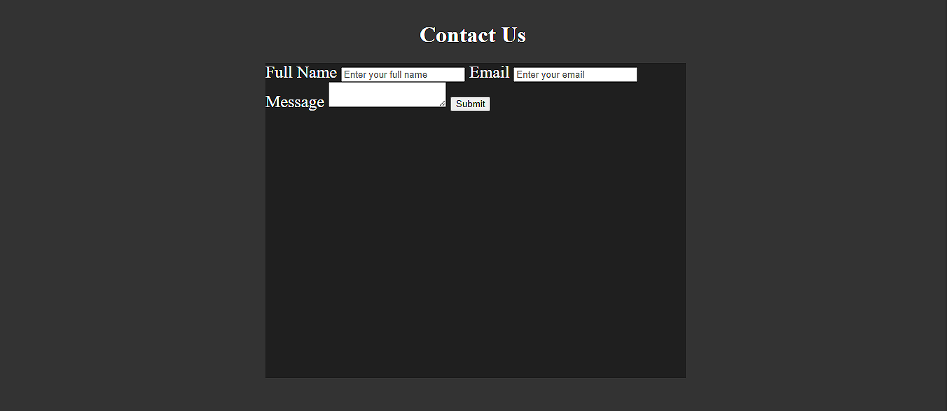
Styling the Contact Us Section
The Contact Us section allows users to contact the CS when they have a question or a complaint. Let’s style this section now:
First, we have created a sub-div named contact_us and set its position:
.contact_us{
	width: 600px;
	height: 450px;
	background-color: rgba(0,0,0,0.4);
	margin-left: 380px;
	color: white;
	font-size: 24px;
}
This is how it should look on the screen:
Your <form> tag should reside within this div.
Now, set the form, labels, and text boxes:
form{
	width: 100%;
	height: 100%;
}
.lbl{
	margin-left: 250px;
	margin-top: 20px;
	display: inline-block;
}

.user_input{
	width: 200px;
	height: 40px;
	display: block;
	margin-left: 200px;
	margin-top: 10px;
font-size: 18px;
}
Set the message box with some inline CSS:
<textarea class="user_input" style="width: 400px; height: 100px; margin-left: 100px;"></textarea>
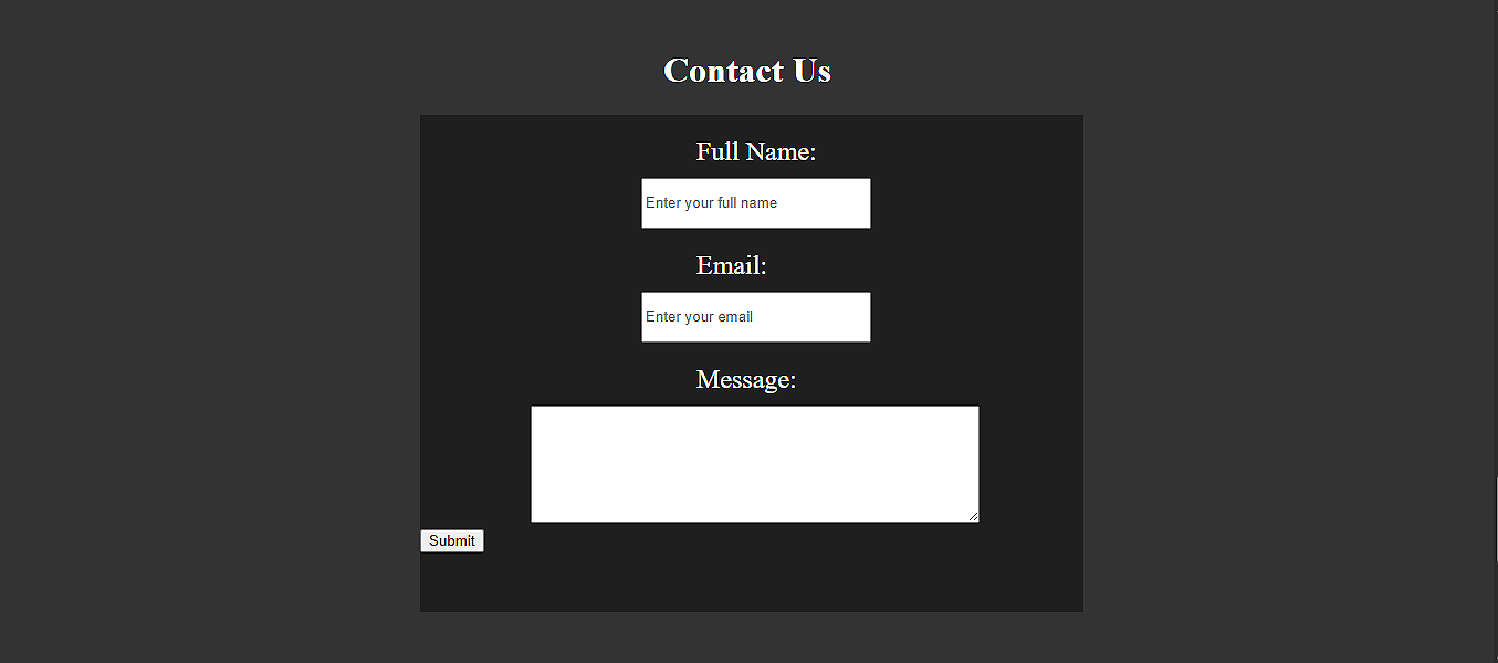
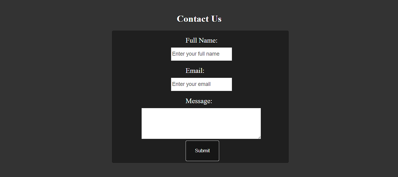
Lastly, set the Submit button by assigning the nav_btn class and with some inline CSS:
<button class="nav_btn" style="margin-left:250px">Submit</button>
Our body section is all set. Here’s how our webpage looks so far:
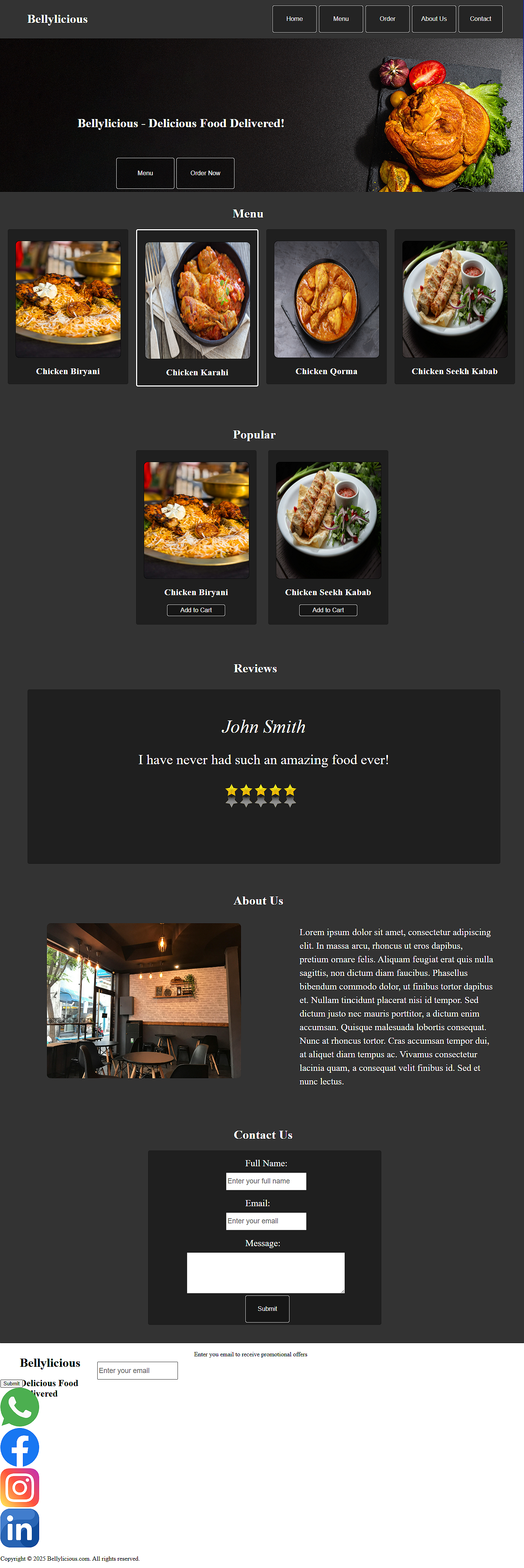
If your webpage looks somewhat similar to the above, you are doing a great job!
In the next article, we will style our footer by reusing the classes wherever possible.